 "RWS Motorsport" (rwsmotorsport)
12/28/2015 at 15:20 • Filed to: None
 7
7
 13
13|
"RWS Motorsport" (rwsmotorsport)
12/28/2015 at 15:20 • Filed to: None | 7
| 13 |
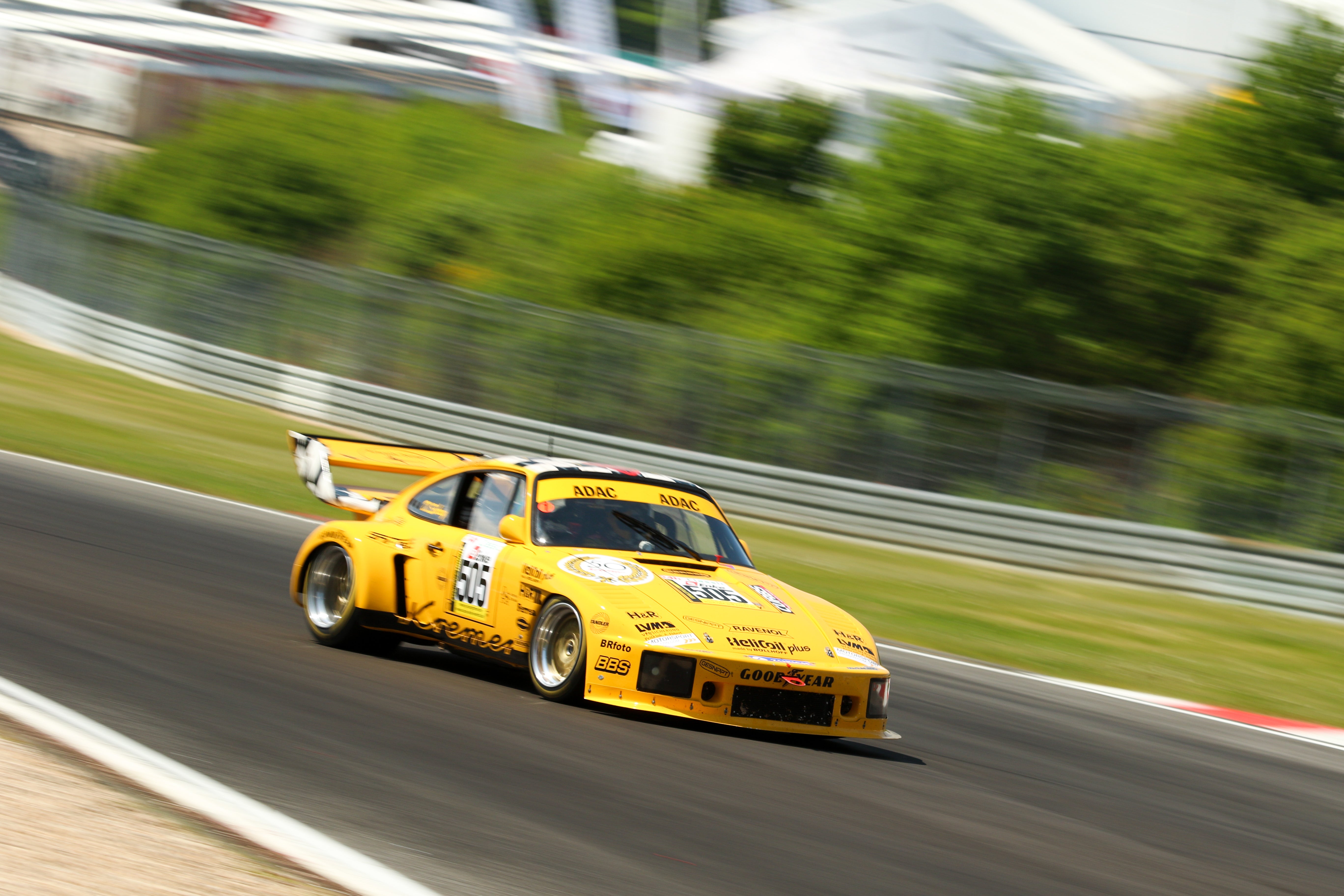
Thanks to the advice of this wonderful place I have gone and set myself up a Sqaurespace website. if anyone could be so kind as to have a look and let me know any thoughts on the site I would be most grateful. Kremer Porsche for your time.
Happy New Year Oppos.
 mcseanerson
> RWS Motorsport
mcseanerson
> RWS Motorsport
12/28/2015 at 15:31 |
|
I like it, very simple and elegant. Only thing I would consider adding is maybe some high-res screenshots of you work on your about section.
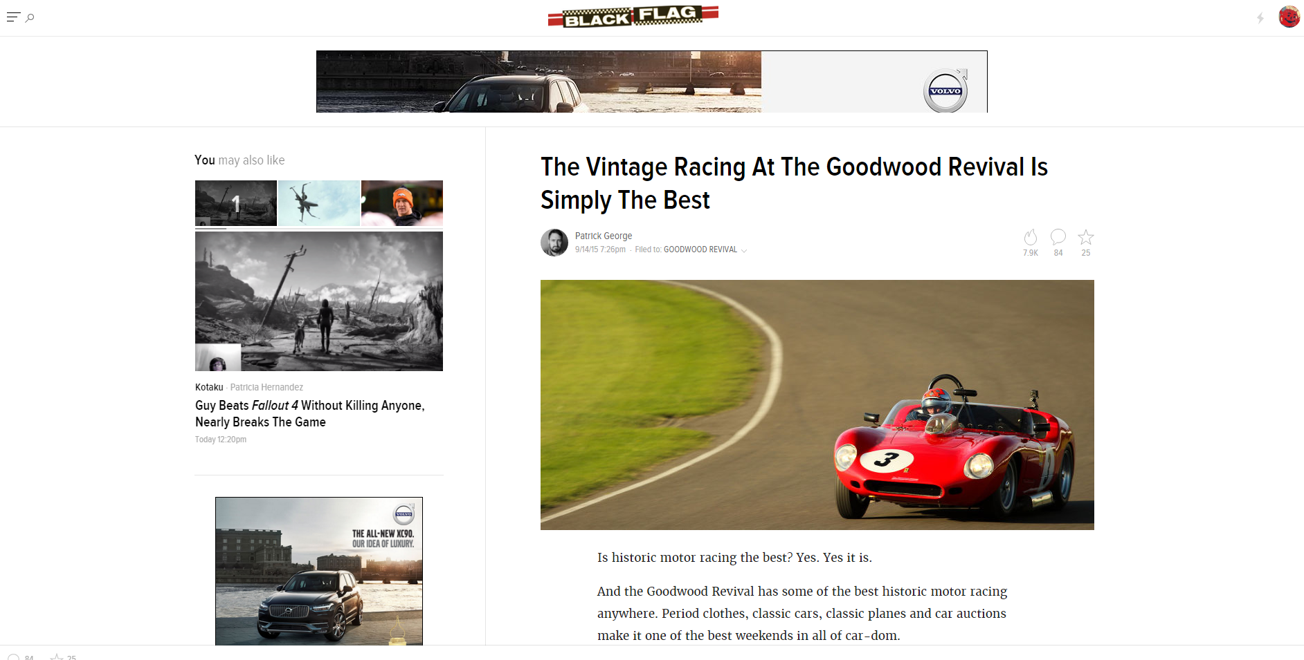
Something like this.
 MarquetteLa
> RWS Motorsport
MarquetteLa
> RWS Motorsport
12/28/2015 at 15:32 |
|
Ditch the welcome page.
|
RWS Motorsport
> mcseanerson
12/28/2015 at 15:39 |
|
Oo very good shout, thanks very much.
|
RWS Motorsport
> MarquetteLa
12/28/2015 at 15:39 |
|
Did you have trouble with it loading? or just not a fan generally?
|
mcseanerson
> MarquetteLa
12/28/2015 at 15:42 |
|
Really? I get why you might say that but I’ve always felt it works for photographers and I liked it on this site.
Edit: Although taking a second look I would get rid of the ‘WELCOME’ part and make your logo the link to enter the site.
|
RWS Motorsport
> mcseanerson
12/28/2015 at 15:49 |
|
I will look into doing that. Personally I quite like the welcome because its a link into the site, but I will see if I can make the logo enter the site. I have had a very quick look and its not immediately obvious how but we will see...
 valsidalv, reminding you that infiniti is an option
> RWS Motorsport
valsidalv, reminding you that infiniti is an option
> RWS Motorsport
12/28/2015 at 15:57 |
|
The “Welcome” is far too small, I had a hard time finding it especially since it’s not outlined or anything and the backdrop is those nice looking photos. If possible I’d make it so that clicking anywhere on the intro page takes you to the main site.
|
RWS Motorsport
> valsidalv, reminding you that infiniti is an option
12/28/2015 at 16:00 |
|
I think that might be the best idea. Just click anywhere to enter the site. Good shout sir, thanks very much.
|
MarquetteLa
> RWS Motorsport
12/28/2015 at 16:06 |
|
I was waiting for the site content to load, trying to scroll to get to the site content, but nothing was working. Until the third photo in the slideshow came around, and that’s when I noticed the very small, very easily miss-able ‘welcome’ link. The text had been washed out by the lightly colored background photos and it wasn’t until the Goodwood Alfa photo came up that I saw it.
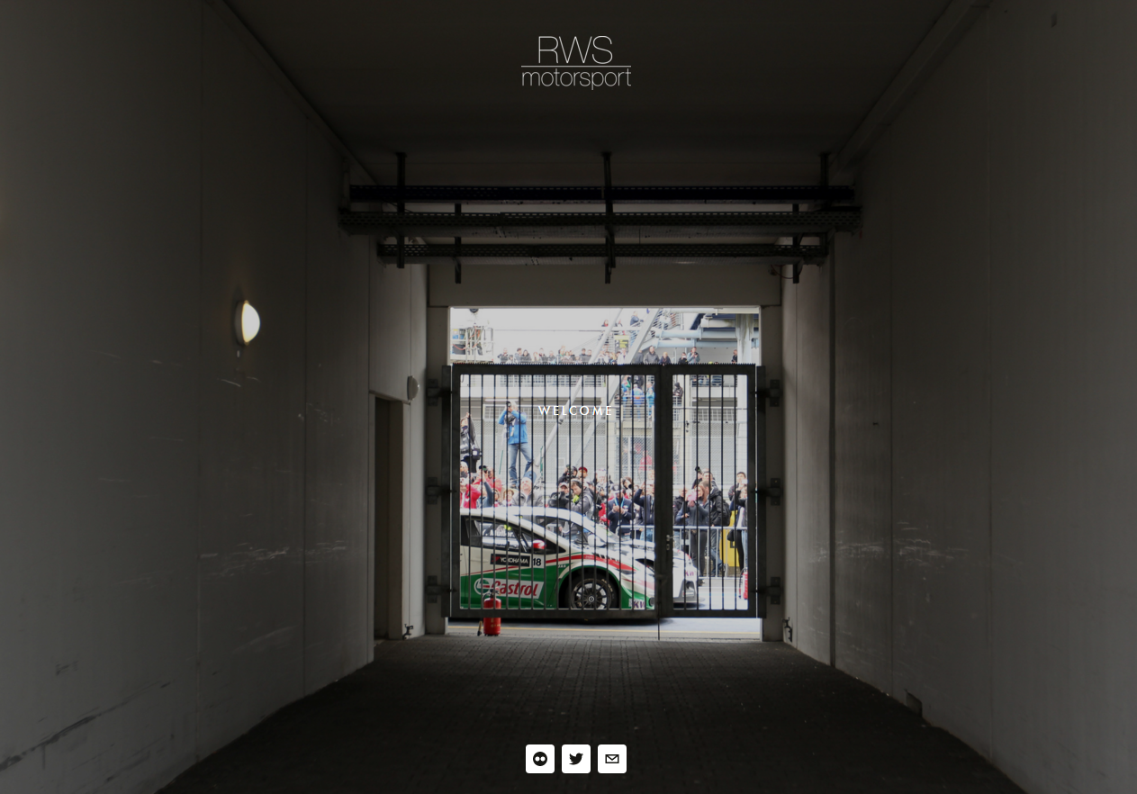
I felt like my time was being wasted with the welcome page. The main site content is filled with your images, so the welcome page just felt wholly unnecessary to me. Streamline the userflow to remove as many barriers to conversion (buying a print, for example) as possible.
- a web designer’s $0.02
Great images, though!
|
RWS Motorsport
> MarquetteLa
12/28/2015 at 16:10 |
|
Thats a very good point, thanks very much. Because I knew where the welcome was I never had any problem finding it (shocking). Ive made it a solid white button now which stands out much more clearly over the photos. Kept it the same size to keep the hierachy looking right.
Thanks very much for your input, very much appreciated :)
 RallyWrench
> RWS Motorsport
RallyWrench
> RWS Motorsport
12/28/2015 at 18:35 |
|
Excellent! Bookmarked.
 Stephen the Canuck
> RWS Motorsport
Stephen the Canuck
> RWS Motorsport
12/29/2015 at 02:28 |
|
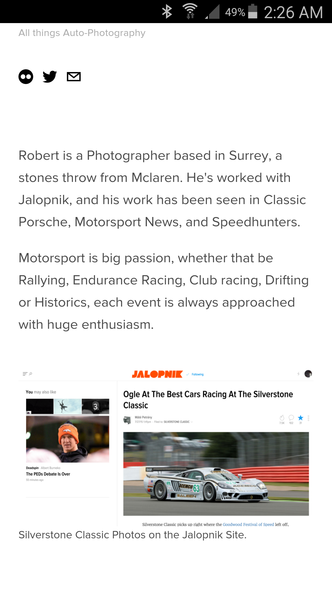
A suggestion, pick a different article for your about section. Choose one that either has your name at the top, or credits your photos in the first paragraph. Other wise it could look like you’re claiming to be someone else.
Like this one:
I would also crop out the related articles on the left side.
 davesaddiction @ opposite-lock.com
> RWS Motorsport
davesaddiction @ opposite-lock.com
> RWS Motorsport
01/08/2016 at 09:59 |
|
Your work speaks for itself!